Chart Widgets
Each chart type can report on either grids, elements or tasks and be filtered to include or exclude information as required.
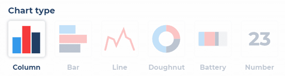
Types of Chart
There are six data visualisations available:
- Column
- Bar
- Line
- Doughnut
- Battery
- Number
Each type has a specific configuration and can be used as best suits your data visualisation requirements.
Creating Widgets
Click the add widget button within a dashboard to add a chart widget. To name your chart widget, click add widget name.
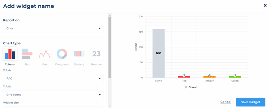
You can then select the data you wish to include, this can be one of either:
- Grids
- Elements
- Tasks
You can now set your required chart type. Depending on the chart type you select, you can then select the data to show on your axis/grouping.
You can set the size of your chart widget, this can be either:
- Full width – the chart widget will expand to take up the full width of the screen
- Small width – the chart widget will take up a third, half or all of the screen depending on the screen size available
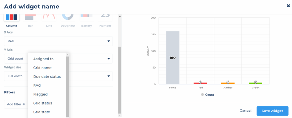
Finally, you can then filter the data shown in your chart. For example, if you had a column chart showing grids, with due date on the X axis and grid count on the Y axis, you can then use the filter to only show data from certain grids. You can do this by filtering by a folder, grid name or grid label. Using these filters within your dashboard charts you can then create dashboards and charts based on your own categorisation of project grids.